J. B. Lippincott tried their hand at a mystery imprint twice. The first was short-lived and had the strangest inconsistency of design and usage. In 1937, Lippincott announced on the rear panel of
The Return of Blue Mask by Anthony Morton (aka John Creasey) that all mystery and detective fiction would be branded with the new logo (shown at left) or -- as they call these motifs in the publishing trade -- a new colophon. The ad copy ran like this:
From now on all Lippincott Mysteries may be identified by the intriguing colophon pictured above. It will appear both on the front and spine of the cover and on the spine of the case of each book. Equally important, it will appear on all advertising of Lippincott Mysteries.
The basic purpose of a colophon is to create advance reader confidence in the a quality of the story. Only by publishing stories that maintain and increase reader confidence can a colophon produce the desired effect.
We recommend DEAD MAN TALKS TOO MUCH by Weed Dickinson, DOWN UNDER by Patricia Wentworth, THE CASUAL MURDERER by Hulbert Footner, PERSONAL APPEARANCE OF A LIONESS by B Virginia Tracy and THE YELLOW CIRCLE by Pearl Foley.
This colophon, incorporating the initials of the publisher into the face of what appears to be a masked burglar encouraging the readers not to tell the secret of whodunnit, lasted from 1937 to 1941. Then it was dropped when a new logo and imprint were launched throughout the 1940s and 1950s. I'll be writing about those books -- Main Line Mysteries -- next week.
Prior to 1937 there was a brief use of a silhouetted man with a
magnifying glass in grasping hand placed on the spine of the DJs. I found a few examples of those and posted them below. But the odd thing is that on the mystery novels written by Carolyn Wells the JBL masked face was
never used and instead the stalking and grasping figure showed up on her books between 1937-1941. Also, note how the Masked Man disappears from the front panel of the DJ midway through 1940 and how it eventually fades away from the boards altogether.
 |
Murder in the Bookshop (1936)
Logo of silhouette with grasping hand |
|
 |
Murder without Risk! (1936)
Also uses the silhouette logo |
|
 |
The Return of the Blue Mask (1937)
First "JBL Masked Man" mystery |
|
 |
Announcement of colophon
Rear panel of DJ at left |
|
 |
Death of a Golfer (1937)
Several early DJs plastered the logo
over the artwork as in this case |
|
 |
The Man in the Blue Mask (1937)
Imprint not yet created, but I wish I knew
more about this contest |
|
 |
The Owl (1937)
The masked man is hiding in the gate (lower right),
but no use of logo on the DJ spine panel |
 |
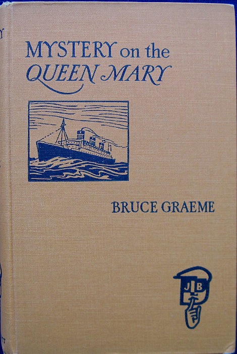
Mystery on the Queen Mary (1938)
Logo used on board |
|
 |
| DJ of book shown at left |
|
 |
| Alias Blue Mask (1939) |
|
 |
Standard use of logo on boards
for books published in 1939 |
|
 |
Calling All Suspects (1940)
Note the use of the hunched figure again |
|
 |
The Mystery of the Stolen Hats (1939)
UK title is: The Man from Michigan |
|
 |
| Blue Mask Strikes Again (1940) |
|
 |
Example of rear panel on DJs
from 1938 -1941 |
|
 |
The House Party Murders (1940)
Logo no longer used on front panel of DJ
(Yes, he's related to the real Edgar Allan Poe) |
 |
The Lava Flow Murders (1940)
Set in Hawaii, series of three books with
a plantation policeman as detective. Unique! |
|
 |
Murder Plus (1940)
Again the hunched over silhouette!
Wells got special treatment apparently |
|
 |
Death Goes Native (1941)
Last use of masked man on DJ |
|
 |
Masked Man logo no longer
used on boards by 1941 |
|


Love the covers of those BLUE MASK books (which I have never sampled) - are they in the Raffles mode. or ..?
ReplyDeleteThe "Blue Mask" series is the same as "the Baron", Sergio. I have about seven or eight more of the Baron books, but I've not read any of them. Maybe I'll remedy that in the coming months. The TV series with Stephen Boyd is on DVD and I was tempted to watch the first disc, but resisted until I've read at least one book. I've read that this is the most popular of Creasey's numerous series apart from the Gideon books. It certainly was the one that lasted the longest (from 1937 to 1971) so he must've liked the character.
DeleteI now eagerly look forward to each entry in this series of informative posts on imprints. Note that my old eyes don't see the magnifying glass in the hunched fugue's hand, just a grabbing hand as if he's reaching for something or in the process of grappling with someone.
ReplyDeleteYour old eyes are better than mine! You're right. Now that I look much closer at the scan of Murder in the Bookshop the silhouette's hand is grabbing for something and not holding anything. I must've been very tired Sunday morning and seeing things when I put this post together or was moving at my usual hasty pace and making assumptions. I'll fix the post now.
DeleteIntriguing post, John. Love seeing these covers. I'm particularly interested in The Mystery of the Stolen Hats. How many hats? Why were they stolen. Is that the only crime in the book? So many questions...
ReplyDeleteI have that book plus a slew of Graeme's other books. There's a blurb inside that says there are three different detectives: one Brit, on American form Michigan, and one French and that the bulk of the book takes place in France. The hats are stolen from policemen, there are two murders, a disappearance... Maybe I need to read this and review it. That ought to answer all your questions. ;^)
DeleteJohn – Those covers take me back to my grandfather’s house. He was a mystery reader and had shelves of books with covers like those pictured. Thanks for the post.
ReplyDeleteOoooh, MURDER ON THE QUEEN MARY. I like the sound of that one, John. LOVE these covers! And I like the colophon too.
ReplyDelete